When Parker Brothers created Rook over 100 years ago, I doubt they spent time researching and planning the pros and cons of the colors they would use for the deck.
I hardly think there were focus groups put in the place to test what colors are best received by their target audience.
I fully suspect the Mr. Parker thought about the primary colors, and likely just wanted colors that were very different than each other.
The colors selected are great, don’t get me wrong.
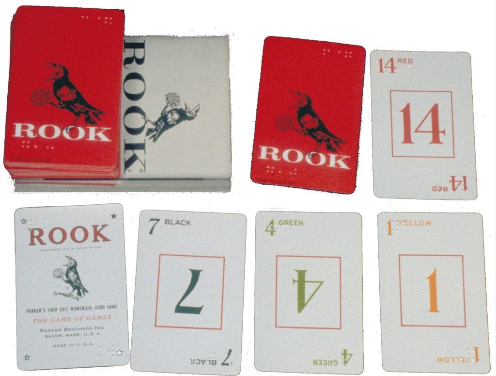
But what I have learned over the years of working with high quality plastic is that colors that work well on paper do not always work as well on plastic.
57 Cards Fully Plastics
When 57 Cards was first created, we did testing of our first run of colors on cheaper plastic-coated paper. The colors stood out great!
In fact, even the color yellow looked good on the paper sample version.
It was clear, strong, and even vibrant. I am a big fan of vibrant colors, so when I selected my yellow design, I wanted something that felt like sun rays, shining through the cards.
So with the card samples approved, we had our first run manufactured.
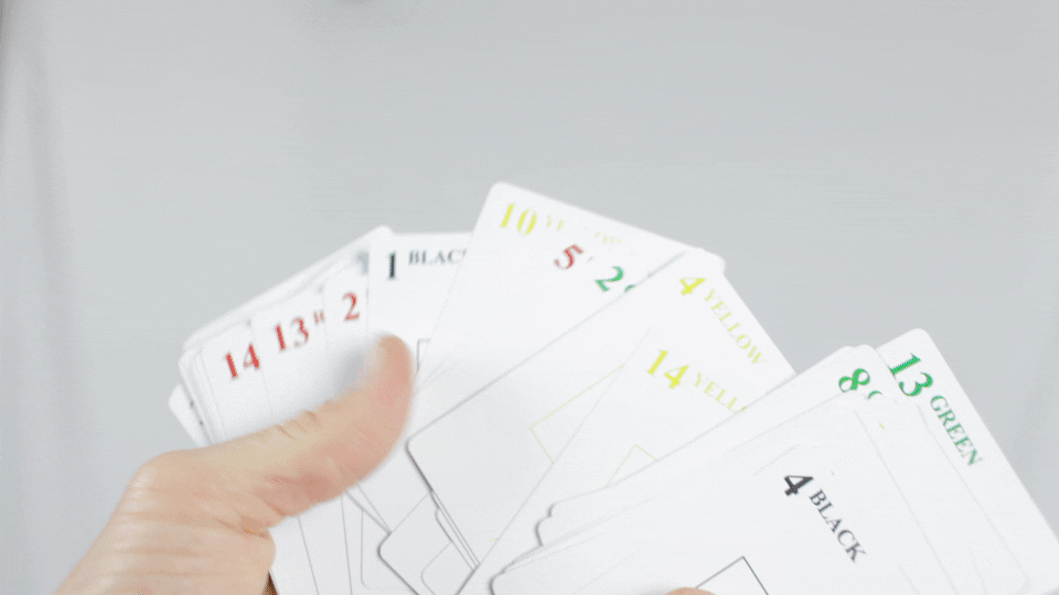
The first deck we manufactured had a lot of good going for it. The cards were sturdy. The deck lasted a long time. But certainly one of the main issues was the color yellow. The dominant, vibrant color that was designed, took a different feel when placed on plastic.
Under certain lighting, the reflective properties of the plastic not only made the yellow less vibrant than we had originally planned, it made it very difficult to even see. In my own home usage, I found myself using permanent marker to assist in color efforts.
The next rounds of 57 Cards Plastics were much improved. Our yellow kept getting deeper, and darker, in an effort to stand out for readability.
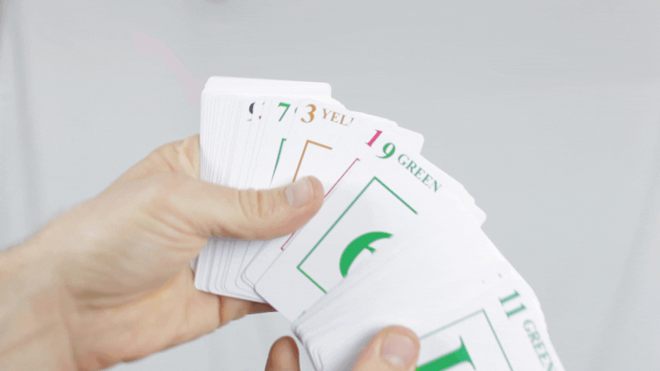
It got so dark in fact that in no longer even resembled yellow.
I’ve always wanted to encourage kids practicing their colors while playing games, so I was disappointed with the darker yellow that could be confusing the little ones.
Thus, the decision was made to go ahead and call the color brown in our 2015 decks.
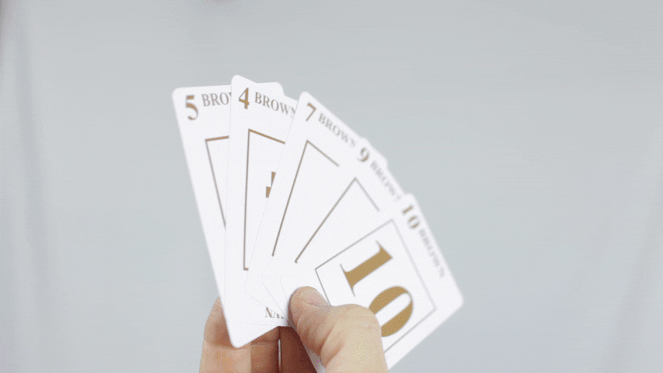
Although not ideal, the majority of the feedback from customers have considered this a welcome change.
…we were not done though.
In 2016 we came out with a colorblind version of our fully plastic deck. In this deck, we decided to play around with the color yellow and bring in some darkening outline.
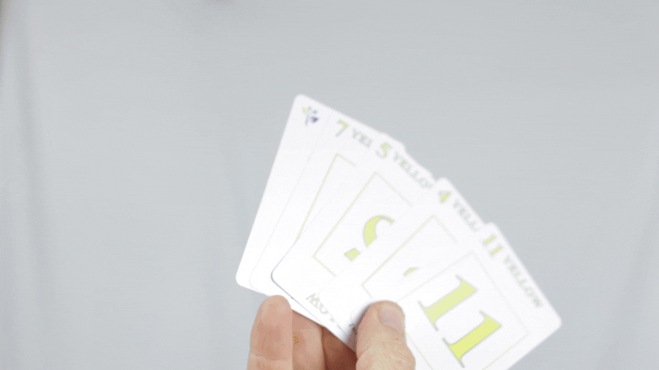
We’ve found that this has worked the best for our fully plastic decks.
In our upcoming release of our latest round of decks, we bring this yellow back with the use of the black outline. We are coming full circle in a sense, but the wait will be worth it. The 2017 deck is expected to really be top notch!
Comments (2)
[…] the re-introduction of a certain missing color [yellow] is the BIG NEWS regarding this version. After we were able to successful produce a way […]
There is such thing as readable yellow characters on a white background without the black boarders around each character when you understand the correct RGB ratio. The perfect ratio of red:green:blue for a readable yellow is 255:204:0. We want to get closer to a marigold (yellow + orange) lowering the green, but we do not want marigold.
For another way to avoid colorblindness, there is a name of the sub-suit color on the top of each card and on the bottom of each card.