57Cards ColorBlind: Shades and Colors that All Can See
2 Questions and Concerns have been consistent over the years of rook card development for 57 Cards LLC. How long will my cards last? and How distinguishable are the colors on the cards?
Creating long-lasting cards has been an issue our fully plastic deck has handled very nicely for a long time. Our fully plastic high quality PVC based cards are sleek and sturdy. They are the the standard quality used for Casinos around the world.
Alleviating concerns on the colors used in our cards has been an issue I admit we have really had to put a significant amount of effort on over the years.
Our colorblind deck is a result of many years of learning how best to prepare colored cards for the masses.
What went into our design?
To start off, we performed many hours of research in the are of color blindness and color vision deficiencies.
One of the options we considered was to introduce a set of objects to relate to each color. However, the more we thought about this, the more it felt like we were heading away from the simplicity that a basic rook deck offers and moving towards a more traditional deck of playing cards.
For professional print design that is prepared for meeting color vision deficiency standards, the standard approach is to incorporate shading into the design.
This was the approach we approved and went with.
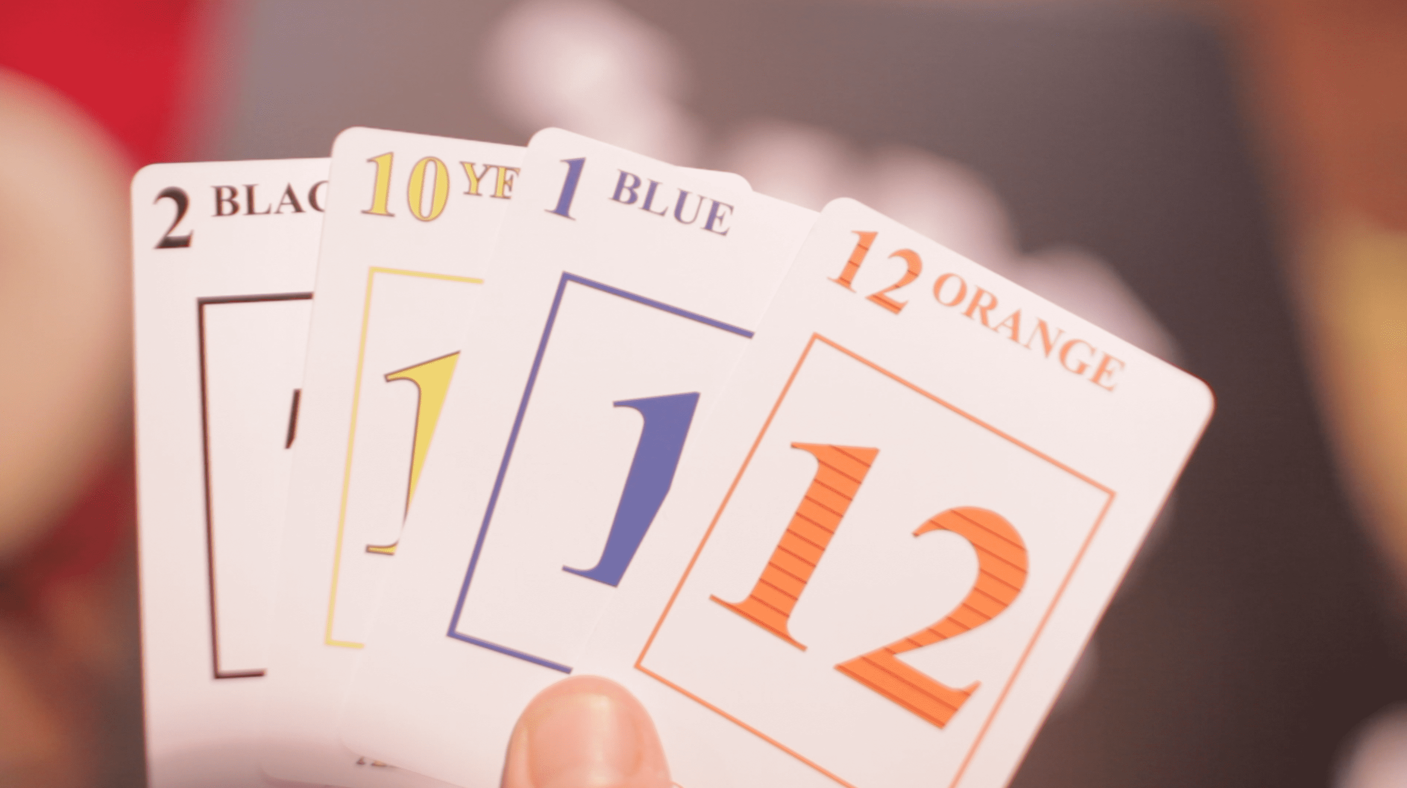
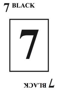
To start, black is proven to be a simple and safe bet that crosses all color barriers. We certainly wanted to keep this color in there.
Second, we wanted to get a slightly lighter shading from black that is easy to distinguish and is also one of the most commonly used colors outside of black. Even in gray scale, blue can easily be distinguished from black and leaves room for a 3rd and 4th color that will not interfere with these first two choices.

The third and fourth colors were slightly more challenging.
Red and Green and two of the most common colors that individuals with color vision deficiency have difficulty distinguishing. In addition, the gray scale version of both green and red can begin to closely resemble some shades of blue.
In order to keep a significant degree of separation from blue and our planned 4th color, we selected a deep orange.
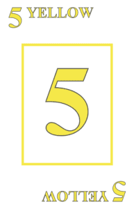
Our 4th color was to be the lightest on the gray scale spectrum. We went with the traditional yellow color.
Why Yellow?
In the past years, yellow has been a real hurdle for our design group to overcome. Plastic printing is different than paper printing colors that are easy to read on paper stock do not always react the same way in the light on plastic stock printing.
But we had a plan.
Part of creating a distinguishable lighter color was to add a dark border around the print. By adding a dark outline to our yellow, we combatted the chance that orange and yellow would look close to each other.
The final touch was adding a layer of shading to our orange color.
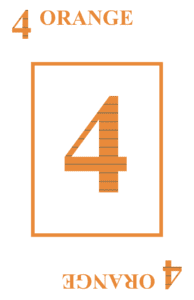
Just to be sure that some color blind individuals did not run into issues distinguishing blue and orange or orange and yellow, we decided to add the final touch which was a few lines of added shading on top of the orange color.
The result is a set of 4 colors that retain the simplicity of regular rook card design, yet incorporate just enough added difference to keep color vision deficient individuals happy and wanting to play more and more games.
No more excuses of “Oh man, I thought that was Red, my bad!”
What went into our printing?
The behind-the-scenes details are very interesting for printing on PVC plastic. Unlike printing on paper, it is not simply a matter of printing on the paper and then putting thin coat of plastic over top…or vinyl.
The professional grade plastic printer we used is a German manufactured beast. There is just no way around it. No skimping when it comes to the printing of these cards.
With the use of this top-of-the-line printer, we have limited our capability to compete with the pricing of plastic coated paper decks. However, what we have done is further improved our decks so that the colors will last longer and longer and fading will be minimal even through many sessions of playing.
We also took careful attention to the backs of the cards, designing them in a manner that makes markings difficult to spot.

Reflection
Our hope for this unique deck of Rook cards is simply to give more people better enjoyment of the games we have grown to love using this special deck of cards. Sure, not everyone will want to go away from the more traditional colors.

Comment (1)
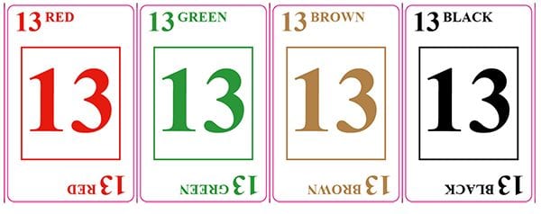
For another way to avoid colorblindness, there is a name of the sub-suit color on the top of each card and on the bottom of each card.